

Create scripts
Get a Google Maps key
To put a Google Map on your web page (whether you use Plug and Play Maps or not), you need to get a Google Maps key and include it in your web page. The next section describes how to insert the key into your web page.
Put the Google Maps key in a web page
The Google Maps key goes into a <script> in your web page to enable Google Maps and import the map scripts that make it all possible. The <script> looks like this, but BE SURE TO REPLACE THIS KEYCODE WITH YOUR OWN or else your maps won't work:
<script src="http://maps.google.com/maps?file=api&v=2.x&key= ABQIAAAAIINK8vsVu6Kw4PqMqajNdxQdRB7racevSMk18ZQLrMieNmiFXxTq-LKFYybJ3qD8oy73Ag3qvDyGEg"></script>
Don't change anything except the keycode. After replacing the keycode with your own, paste the whole <script> into your web page. It can go either in the <head> or the <body> section of your web page. If you only have access to part of your web page (for example, if you are using something like Wordpress), just paste the <script> into the main content area of your page.
Put a Plug and Play Map in a web page
To let Plug and Play Maps create your map for you, you also need to add a <script> telling it what data you want to map and how you want it displayed. This can be quite simple (as in this example, which you can use for testing out your own web page):
<script src='http://www.plugandplaymaps.com/js/?datafile=http://www.plugandplaymaps.com/gallery/data/states.csv'></script>
or it can be a bit longer if you want to specify, for example, the colors or weights to use when plotting your data, the legend text, or other settings. You can quickly and easily get the <script> you need for a single data layer by using the interactive Designer. You can also add more than one data layer to your map.
Check for errors in your Plug and Play Maps <script>
If you are having problems getting your map to work or to appear correctly, there may be errors in the <script> or in the data you are trying to map. Although Plug and Play Maps may see these problems, by default it just does the best it can without complaining "out loud" so your web site visitors are not presented with error messages that they can't do anything about. To illustrate, the gallery contains an example <script> with error alerts enabled and some errors in the data.
While you are working on your map, you can display a list of errors in a popup alert when your page loads. This is useful during development, to help you find them and remove any problems, but you probably want to turn this error-checking off when you go live with your web page so that your users won't see any confusing error messages (especially if either the data being mapped or the <script> itself are being generated in real time, because in that case you may not see errors during testing but they may come up later).
To activate error alerts, set this flag as a query parameter in your call to Plug and Play Maps:
&e=on
Use data sources
Choose between datafiles with query parameters vs. a JSON string
Plug and Play Maps was designed to meet a variety of needs, so we offer a variety of ways to pass along the information needed to create your map.
The main choice you need to make is whether to pass your data in separate datafiles (for example, CSV or DBF files saved from a spreadsheet or database program) with some optional query parameters to indicate how you want the data plotted, or in an all-in-one, data-plus-settings string in the JSON format.
You will most likely want to use datafiles and query parameters if you want to plot data from files you already have on your computer. The JSON option is probably what you will want to use if you want to map data coming out of your web database that might change from time to time, especially if you are (or have) a web programmer to write a few lines of code to generate the JSON string.
There is no particular advantage of one method over the other. Both methods offer essentially the same mapping options with the same instructions, but it's probably a bit tedious to create JSON strings of data if you are not pulling the data directly from a web database with a program. In either case, the data can change as often as you like, either by changing the data in the datafile you are mapping, or by changing the data in the database you are pulling from.
The gallery includes a pair of maps that use the same data, one using a CSV file and one using a JSON string. Look at the maps, their <script>s, and their data to see the differences.
Create a map from a spreadsheet
You may already have data that's ready to map. If you have a spreadsheet file with data that gives some kind of location for each row (latitude and longitude, or a State or Country code, for example), then just save it to a CSV file (Comma Separated Values) and pass the URL of that file in your Plug and Play Maps <script>. This gallery example uses a CSV file which you can look at by clicking on the file name in the example's <script>.
Create a map from a Google Docs spreadsheet
Google Docs lets you create, store, and publish spreadsheets that are saved on Google's servers instead of your computer. You can use these spreadsheets as a data source for Plug and Play Maps in the same way as you do any other file. However, there are two things you need to take care of to ensure success: you must Publish your Google Doc spreadsheet (not share, but Publish) in the CSV output format, which will generate an URL (e.g,. http://spreadsheets.google.com/pub?key=tGoK-YKxkZOCiR4my2PfBBg&output=csv) for you to refer to the data; and you must "urlencode" the URL in the Plug and Play Maps <script> if you are creating it by hand (if you use the Designer it will urlencode the URL for you).
Create a map from a text file
Plug and Play Maps can work with data in text files if the data are organized as a CSV file (Comma Separated Values) or a JSON string.
This gallery example uses a CSV file which you can look at by clicking on the file name in the example's <script>. Note that you must include the column headings in the CSV file so Plug and Play Maps can figure out which column contains the location information and what the other columns are for. You can include columns to control how the data will appear in the map as well as their locations.
A single JSON file can contain multiple datasets with all of the map settings; the file contains exactly the same contents as a JSON string that you can pass directly in the <script>, but with the advantages of faster processing (the data makes one less trip because it doesn't first travel from your server to the web browser in the <script>) and more readable layout (you can include line breaks, whitespace, etc). See the JSON examples and the discussions below of map, legend, and data settings for more information on JSON settings.
Create a map from a database file
Plug and Play Maps can process DBF files if each record has some kind of location information (latitude and longitude, or a State or Country code, for example). Put the file on your server and pass the URL of the file to Plug and Play Maps in the <script>, as in this gallery example.
Create a map from a shapefile
Shapefiles are a GIS data format developed by ESRI that contain the location of points, lines, or polygons (only one type of feature per file). Shapefiles do NOT include information on how to display the features (colors, weights, icons), so you will have to provide that information with additional query parameters if you want something other than the defaults. This gallery example shows how to do this.
Create a map from a KML or KMZ file
Plug and Play Maps displays KML and KMZ files (KMZ files are simply compressed (zipped) versions of KML files). KML files include location information for points, lines, and areas, optional information on how to display those features (colors, icons, etc), and optional information for popup windows when the features are clicked. Plug and Play Maps displays KML point, line, and polygon features, including any pop-up window information, but uses whatever symbols you specify in the <script> (or the defaults), rather than using any symbols and colors given in the KML file. This gallery example can be compared to the original version displayed at Google Maps.
Create a map from a web database
If you have data in a database on your web server, you can create up-to-the-minute maps of your data that are created on demand every time someone visits your website.
Although you can export the data from your database into any of the file formats mentioned above and use it that way, you will be more or less limited by the features each of the file formats supports.
A much better way to go is to create a single JSON data string that contains your entire map specification; in fact, the original design of Plug and Play Maps was intended to support just this approach, which gives you the most complete control over your map and data. A JSON string is a single JSON object with opening and closing braces: {objects defined here}.
For Plug and Play Maps, the structure is kept relatively flat, with the following top-level objects: mapsettings, icons, charts, lines, and areas. The first (mapsettings) is a simple object of "option": "setting" pairs; the other four are arrays of one or more data layer objects each, where a data layer object is a simple object of "option": "setting" pairs. At either level (top-level objects or within each data layer object), order doesn't matter. You can specify "charts", then "mapsettings", then "icons", for example, and the result is the same as if you put "mapsettings" first or last.
For more ideas on what you can do with JSON, read the discussions below on map, legend, and data settings, and also take a look at the JSON-based examples in the gallery. Here, we provide a simple overview to give you the sense of what the JSON string looks like and how you might create it on-the-fly from your web database and web server running some server-side code such as PHP, ASP, or ASP.NET.
Perhaps the best way to present the JSON format is with an example. This example is formatted as a stand-alone text file, in which you can include line breaks and white space. (You can pass such files to Plug and Play Maps instead of the inline JSON string by simply passing the URL of the JSON text file instead of the JSON string itself; e.g., j=http://mysite.com/data/myjson.txt rather than j={"mapsettings": ...}. Below the sample data is a Plug and Play Map which does exactly that).
This example describes a single data layer and a few map settings. The data layer includes some layer-wide settings, plus an array of data items ("items") and corresponding array of data records ("values"). A simplified version of this JSON data is used as the input for this gallery example, where all of the data are in a single in-line JSON string rather than a stand-alone file. The resulting map is displayed below this table; if you are wondering how the map "knows" the shapes of the states to display when we are not giving it any coordinates in the JSON, read the section below on using state and country codes to indicate the features or locations to map.
{"mapsettings": {"zoominit": "-125,25|-70,50", "typeinit": "terrain"},
"areas": [{"legtext": "States", "colorscaleitem": "Year admitted", "colorbar": "pseudo",
"items": ["ST", "Name", "Order admitted", "Year admitted"],
"values":[
["AK","Alaska",49,1959],
["AL","Alabama",22,1819],
["AR","Arkansas",25,1836],
["AZ","Arizona",48,1912],
["CA","California",31,1850],
["CO","Colorado",38,1876],
["CT","Connecticut",5,1788],
["DE","Delaware",1,1787],
["FL","Florida",27,1845],
["GA","Georgia",4,1788],
["HI","Hawaii",50,1959],
["IA","Iowa",29,1846],
["ID","Idaho",43,1890],
["IL","Illinois",21,1818],
["IN","Indiana",19,1816],
["KS","Kansas",34,1861],
["KY","Kentucky",15,1792],
["LA","Louisiana",18,1812],
["MA","Massachusetts",6,1788],
["MD","Maryland",7,1788],
["ME","Maine",23,1820],
["MI","Michigan",26,1837],
["MN","Minnesota",32,1858],
["MO","Missouri",24,1821],
["MS","Mississippi",20,1817],
["MT","Montana",41,1889],
["NC","North Carolina",12,1789],
["ND","North Dakota",39,1889],
["NE","Nebraska",37,1867],
["NH","New Hampshire",9,1788],
["NJ","New Jersey",3,1787],
["NM","New Mexico",47,1912],
["NV","Nevada",36,1864],
["NY","New York",11,1788],
["OH","Ohio",17,1803],
["OK","Oklahoma",46,1907],
["OR","Oregon",33,1859],
["PA","Pennsylvania",2,1787],
["RI","Rhode Island",13,1790],
["SC","South Carolina",8,1788],
["SD","South Dakota",40,1889],
["TN","Tennessee",16,1796],
["TX","Texas",28,1845],
["UT","Utah",45,1896],
["VA","Virginia",10,1788],
["VT","Vermont",14,1791],
["WA","Washington",42,1889],
["WI","Wisconsin",30,1848],
["WV","West Virginia",35,1863],
["WY","Wyoming",44,1890]
]
}]}
Get data locations
Get the coordinates (latitude, longitude) for a point
There are many sources for point locations, including maps (paper or electronic), GPS units, and databases. For your convenience, we will soon be providing some tools to help you create your own list of point coordinates that you can use for your Plug and Play Maps, but there are many already available elsewhere on the web: try iTouchMap or GISmatters.
Get the coordinates (latitude, longitude) for lines or polygons
There are many sources for line or polygon coordinates, including maps (paper or electronic), GPS units, and databases. For your convenience, we will soon be providing some tools to help you create your own lists of line coordinates that you can use for your Plug and Play Maps, but there are many already available elsewhere on the web: try BirdTheme or GISmatters.
Use addresses
You can use street addresses as point locations in many countries. If your data includes an item called "address", or if you provide a query parameter or JSON setting specifying the addressitem (the name of the data column that contains the addresses), then your data will be mapped using those addresses.
Note that this option can be more time-consuming and error-prone than using pre-determined latitudes and longitudes.
Example with query parameters in the Plug and Play Maps <script>:
&datafile=http://mysite.com/data/properties.dbf&addressitem=PropertyAddress
Example with JSON string or file:
"icons": [{"datafile": "http://mysite.com/data/properties.dbf", "addressitem": "PropertyAddress"}]
Use state or country codes
Plug and Play Maps has a built-in coordinate database for common point, line, and area features such as state and country mid-points or outlines. Using these, you can map your data without having to provide coordinates -- just use a code such as the two-letter state codes (AK, NV, etc) and we'll put it on the map in the right place! We call these features "tagged locations" because the locations are tagged by a common code that you are probably already using so you don't have to go out and find the actual coordinates or shapes of the locations you want to map. Several of the examples in the Gallery use this feature.
At present, we offer mid-point locations and generalized outlines of the 50 U.S. states and the District of Columbia (loctag:ST) based on standard 2-letter state codes, and mid-point locations for every country of the world (loctag:CCISO if you want use ISO 3166-1 country codes, or loctag:CCFIPS if you want to use FIPS country codes).
Tagged locations come in sets; the set has a name (e.g., ST or CCISO), and the set itself is just a list of location or feature tags (e.g., AZ, KY, MA) and the corresponding geometry (a point location, or a set of line or area coordinates) for each one. They can be thought of as "shared geometry" that one or more of your datasets can use by linking one of your data items (e.g., a country code) to the geometry in the tag set by matching your code with the tag. If you have worked with database or GIS software, you might recognize this as a "join" of two tables on a key field: you are joining your datafile to the tagset and its geometry using a (hopefully!) matching set of values -- the tags.
The simplest way to accomplish this is to name your data item with the name of the tagset you want to use; Plug and Play Maps will automatically use the geometry from the tagset you name whenever it can match one of your item values with a tag in the tagset. For example, if you have a column in a spreadsheet or database file named "CCISO" and store ISO country codes in that column, each row will be automatically displayed on the map using the location geometry for the country code in that row.
If you have data items like state or country codes in a column that has some other name (e.g., State Code) that doesn't match the name of the tagset, you can still use the tagset (without renaming your data item) by explicitly telling Plug and Play Maps which of your data items has the tags (the state or country codes) and which tagset they refer to. You can do this by using query parameters or JSON settings, as shown in these examples:
Example with query parameters, indicating your data item StateCode in file cancerrates.csv contains tags for using the tagged locations in the tagset ST:
&datafile=http://mysite.com/data/cancerrates.csv&loctagitem=StateCode:ST
Example with JSON string or file, indicating your data item Country in file income.csv contains tags for using the tagged locations in the tagset CCISO:
"icons": [{"datafile": "http://mysite.com/data/income.csv", "loctagitem": "Country:CCISO"}]
Provide your own tagged locations
You can provide your own tagged locations that can be shared among one or more of the datafiles you want to map. You might do this because you happen to have data values you want to map in a different file than your shapes, or you might do it to share the same geometry among several data layers without having the geometry uploaded separately for every data layer, speeding up the rendering of your maps. For even faster performance, you could consider hosting your tagset files on our server.
To supply and use your own tagsets (files of tagged locations or shared geometry), you need a file with labeled geometry, such as a shapefile, spreadsheet, database file (no support yet for KML) and one or more files that reference those locations. You tell Plug and Play Maps about your tagsets using query parameters like this:
    &tagsets=http://mysite.com/data/towns.shp,TOWNS,Name;http://mysite.com/data/roads.shp,ROADS,Name
    &datafile1=http://mysite.com/data/members.csv&colorscaleitem1=Count
    &datafile2=http://mysite.com/data/routes.csv&weightscaleitem2=Carpool
As you can see, you may provide more than one tagset by separating the tagsets with a semicolon (;). Each tagset definition must have 3 parts: the file containing the tags and geometry, the name you want to give to this tagset, and the name of the column in the tagset (not in your other datafiles) that contains the tags you will use to find each geometric feature. In other words, you are saying (for the first tagset) "Use the tags in column 'Name' of file 'http://mysite.com/data/towns.shp' for mapping data items in my other data files... I'll make sure there's a data item called TOWNS containing town names in my other datafiles (e.g., members.csv) whenever I want to map data values against the town geometries defined in towns.shp". Note that the tagset name and tag column name are case-sensitive -- what you specify in the tagsets parameter must match what is in the tagset and datafiles you want to use. As with the built-in tagsets, if you cannot or do not want to name your data items with the name of the tagset, you can instead use the same &loctagitem=dataitemname:TAGSETNAME option described for those built-in tagsets.
Hosting your data on the Plug and Play Maps server
For performance and convenience, you may want to host your data files on the Plug and Play Maps server.
When you reference a datafile or tagset file on the web (e.g., http://someplace.com/data/file.csv), the data makes two trips before it can be rendered in a map: first, Plug and Play Maps has to download the file across the network to process it into the mapping script; second, the processed data goes out (usually in more compact form) within the script returned to the browser.
The first of these trips takes the most time, as it involves all of the overhead of requesting and transferring files over the network, and the data volume is usually much larger (because it is not encoded and may include data items you are not interested in mapping). You can bypass this trip and significantly speed up the rendering time of your maps by hosting your datafiles on our server.
Hosting the files also simplifies your scripts, as the file references are shorter and, if you are using tagsets can just be specified once and used by as many data layers as you wish. Furthermore, we can offer higher filesize limits for hosted files, so you can render more complex data or more features in your maps.
To use a file you have uploaded to the server, you reference it with the previx "hosted:" instead of the "http://..." location:
&datafile1=hosted:roads.shp
There is a small charge for this service based on the data volume you wish to host. If you are interested, please contact us.
Style the map
Set the map location and size
By default, the map is put on your web page wherever you insert the Plug and Play Maps <script> in your web page's HTML. The map will be a pre-determined height and width, and if you don't disable the legend, it will have a legend to its right. The map style (border, etc), is also pre-determined.
You can position and style your map and legend differently by providing your own <div> and passing that <div>'s id to Plug and Play Maps as a query parameter in the <script>. With this approach, you can completely control the position, size, and appearance of the map and legend (see the legend div section for further details on styling the legend). The following example shows <script> in the HTML <head> section referring to the <div> that will contain the map in the <body> section:
    <head>
        ...
        <script src="http://maps.google.com/maps?file=api&v=2.x&key=ABQIAA...."></script>
        <script src="http://www.plugandplaymaps.com/js?m=mymapdiv&j={"icons":[{"items": ["latlon"], "values": [["42,-72"],["42.5,-72.5"]]}]}'></script>
        ...
    </head>
    <body>
        ...
        <div id=mymapdiv style="width: 600; height: 400; border: 3px solid blue;"></div>
        ...
    </body>
Set the initial map type
You can specify the map type to display when your map first opens as one of the following: streets, satellite, hybrid, or terrain. By default, the map will have buttons to change the map type while the user is browsing, but you can also disable those buttons (see next section) if you only want your users to see a single map type.
Example with query parameters in the Plug and Play Maps <script>:
&typeinit=terrain
Example with JSON string or file (note that you could set more than one thing in the "mapsettings", separated by commas):
"mapsettings": {"typeinit": "satellite"}
Configure the map controls
You can control whether or not to display various map controls, how big they should be, and whether the map can be zoomed by double-clicking.
Example with query parameters in the Plug and Play Maps <script>:
&typectl=off&zoomctl=small&dblclkzoom=off
Example with settings in a JSON string or file:
"mapsettings": {"zoomctl": "off", "scalectl": "off"}
Set the initial map zoom
You can specify an area to appear in the initial map view. Depending on the shape of the area you specify and the shape of the map, you may see more than what you ask for.
Example with query parameters in the Plug and Play Maps <script>:
&zoominit=37,-80|47,-68
Example with settings in a JSON string or file:
"mapsettings": {"zoominit": "36,-124|48,-104"}
Style the data
Choose between icons, charts, lines, and polygons
When you pass data to Plug and Play Maps, you may also need to say how you would like the data to be displayed on the map: as icons, as charts, as lines, or as areas (closed, filled polygons). This could be because one feature type (e.g., points) can be displayed in two ways (as icons or as charts), or because there is more than one type of feature in the file and you need to say which type you want to map for a particular layer (e.g., KML files), or because the data file you are mapping does not contain enough information about the kinds of features it contains and Plug and Play Maps won't know how to display the data.
Example with query parameters in the Plug and Play Maps <script>:
&datafile=http://mysite.com/data/somepoints.csv&sym=charts&...(the chart settings -- see this gallery example for details)
Example with settings in a JSON string or file:
"charts": [{"datafile": "http://mysite.com/data/somepoints.csv", ...(the chart settings -- see this gallery example for details)}]
Set shapes, colors, and weights
Data are displayed on a map using symbols, which can have color, weight (icon size, line thickness, or area opacity), and shape (for icons*). These styles can be fixed (all the same) for all the features in each data layer, or they can be color-scaled and/or weight-scaled to show how values within a data layer vary from place to place across the map.
Use fixed (all-the-same) shapes, colors, and weights
By default, Plug and Play Maps uses a single fixed style for all of the features within each data layer, assigning a distinct default color, weight, and shape for each data layer so they can be easily distinguished from each other on the map. You may wish to override these defaults for the fixed styles, which you can do for any or all data layers in your map.
*at present, available icon shapes are marker, dotmarker, pushpin, and circle
Example with query parameters in the Plug and Play Maps <script>:
&datafile=http://mysite.com/data/somepoints.csv&color=purple&shape=pushpin&weight=0.75
Example with settings in a JSON string or file:
"icons": [{"datafile": "http://mysite.com/data/somepoints.csv", "color": "purple", "shape": "pushpin", "weight": 0.75}]
Create a color-scaled layer
If you want to see the patterns of your data across a region, you can use a colorscale to assign a distinct color to each icon, line, or area based on the value of a data item. For example, you might want to color-code the U.S. states by the number of registered voters of a certain party, or by the number of cases of a disease per capita. The colored icons, lines, or areas will make your map much more informative (and colorful!) than a collection of identical-looking features. There are lots of examples of this in the Gallery.
To set up a colorscale, you just need to specify the "colorscaleitem", the data item whose value you want to use to set the scaling. By default, the colors will be assigned from a standard colorbar with the first color assigned to the smallest data value and the last color assigned to the largest data value.
You can, of course, override this behavior by specifying any or all of the following: the colorbar to use*, the data value to use for the first color, and/or the data value to use for the last color. The reason you might want to specify the minimum and maximum values for the colorscale is to compare two or more maps whose data ranges aren't the same -- by specifying the same min and max values in two maps, you ensure that each color means the same thing in both maps.
*available colorbars are: pseudo, rainbow, red, green, blue, and gray
Example with query parameters in the Plug and Play Maps <script>:
&datafile=http://mysite.com/data/energy.shp&colorscaleitem=gascost&colorminval=2.50&colormaxval=7.50
Example with settings in a JSON string or file:
"icons": [{"datafile": "http://mysite.com/data/energy.shp", "colorscaleitem": "gascost", "colorminval": 2.50, "colormaxval": 7.50}]
For colorscaled data layers, Plug and Play Maps automatically creates a legend showing the colorbar as a spectrum of colors, along with the type of symbol and the min and max data value ranges and the name of the colorscaleitem as a label. If you do not like the default legend display you can customize both the colorscaleitem label text and the min and max number format.
Create a weight-scaled layer
If you want to see the patterns of your data across a region, you can use a weightscale to assign a distinct weight to each icon (size), line (thickness), or area (opacity) based on the value of a data item. For example, you might want to weight the U.S. states by median income, or by the number of people over the age of 65. The weighted icons, lines, or areas will make your map much more informative than a collection of identical-looking features. There are examples of this in the Gallery.
To set up a weightcale, you just need to specify the "weightscaleitem", the data item whose value you want to use to set the scaling. By default, the weights will be assigned from a standard range with the least weight assigned to the smallest data value and the greatest weight assigned to the largest data value.
You can, of course, override this behavior by specifying any or all of the following: the weight range to use*, the value to use for the first weight, and/or the data value to use for the last weight. The reason you might want to specify the minimum and maximum values for the weightscale is to compare two or more maps whose data ranges aren't the same -- by specifying the same min and max values in two maps, you ensure that each feature weight means the same thing in both maps.
*the weight range is the min and max icon size, line thickness, or area opacity
Example with query parameters in the Plug and Play Maps <script>:
&datafile=http://mysite.com/data/members.shp&weightscaleitem=registered
Example with settings in a JSON string or file:
"icons": [{"datafile": "http://mysite.com/data/members.shp", "weightscaleitem": "registered"}]
For weightscaled data layers, Plug and Play Maps automatically creates a legend showing the symbol range as a pair of symbols of varying size or opacity, along with the min and max data value ranges and the name of the weightscaleitem as a label. If you do not like the default legend display you can customize both the weightscaleitem label text and the min and max number format.
Show ratios or normalized data values when scaling
There is an option when creating a colorscale or weightscale that lets you divide one data item by another and apply the scale to the results of the division: &colordivby (or &weightdivby) names the item in the data layer by which to divide the colorscaleitem (or weightscaleitem). This is handy if you want to map your data on a per-person or per-area basis, or if you want to map values that are parts of a whole.
This solves problems like "there's more of everything in California": if you map things by State that are related to population (people over 65, cars, jobs, congresspeople, etc) or to area (acres of farmland, miles of roadways), there will almost always be more of them in California than in other states, and Rhode Island will often be trailing the pack. In other words, all the maps will tend to look the same. What you probably want to do is to divide the item you want to map (cars, for example) by the population of each state (or the population in a particular age range, or the area of each state) to give the number of cars per person or percentage of farmland or the like, which will not necessarily be highest in California and lowest in Rhode Island.
When you use this this option, the legend display for the layer automatically creates a label showing the division, for example "POPULATION / SQKM" for population density computed by dividing the data item POPULATION by the data item SQKM. As for other scaling methods, you can supply your own text label with the &colorscalelegtext (or &weightscalelegtext) parameter, for example &colorscalelegtext="People per square km". You may also want to customize the number format for the min and max range labels.
Create a color-by-category layer
Some data are organized into categories rather than numeric values. Buildings might be categorized by type such as "School", "Hospital", "Fire Station", etc., or streams might be categorized by terms like "River", "Stream", "Creek". Or you may have numeric values or codes that do not imply a particular size or magnitude, so color-scaling would give the wrong impression. Or you may have numeric values that do imply size, but you want to highlight their pattern by putting the values into a small set of distinct classes with their own colors. In all of these cases, you can color-code the display for the datalayer by categories using a colorclassitem and a method for breaking the item values into categories or classes with the colorclasses parameter. For example:
&datafile=http://mysite.com/data/buildings.shp&colorclassitem=buildingtype&colorclasses=uniquevalues
There are currently four methods for creating color categories or classes: unique values (every distinct data item gets its own color); percentiles (all data items are sorted, then the collection is split into classes containing equal numbers of members); equal intervals (the full range of the data values is divided into equal-sized numeric intervals, and then each data item is colored by which interval its value falls within); and custom breaks (you specify the numeric data values that separate one color class from another). Except for unique values, each method provides additional parameters that you can specify to control the number and size of the classes, as follows:
&colorclasses=percentiles:4
splits the data items into as many classes as you specify; in this
example four categories would be created, each with 25% of the population (the
lowest 25% of the data values, then the next 25%, up to the top 25%).
&colorclasses=intervals:6
splits the data range into as many classes as you specify; in this
example, six equal intervals would be created, each as wide as 1/6th of
the full data range (if the range of
values for the specified colorclassitem is from 0 to 300, each color class
would be 50 -- e.g, 0-50, 50-100, 100-150, etc).
&colorclasses=breaksat:10,20,50,100,500
splits the data into classes with breaks at each specified value; in this
example, there would be six classes with ranges of 10 and under, 10-20,
20-50, 50-100, 100-500, and 500 and over.
When coloring by category, items are displayed with colors taken from a colorset or a colorbar (for uniquevalues, only colorsets are allowed). Colors are taken from a colorbar by picking colors along the bar at equal intervals based on the number of classes. When assigning colors from a colorset of distinct colors, the first category is given the first color from the colorset, the second category is given the second color, and so on. If all of the colors of the colorset are used and there are still more categories, the colors are recycled beginning again with the first color in the colorset.
The default colorset consists of 16 pre-defined colors: red, green, blue, cyan, pink, yellow, lightred, lightgreen, lightblue, darkcyan, purple, orange, darkgray, lightgray, white, and black. You can specify a different colorset with the &colorset= parameter; other available pre-defined colorsets are named "bold8", "soft8", and "temperature", defined as follows:
bold8: red, green, blue, pink, yellow, cyan, orange, black soft8: darkcyan, lightred, lightgreen, lightblue, lightgray, purple, white, darkgray temperature: purple, blue, lightblue, green, yellow, orange, red, white
If none of these colorsets are suitable, you can define custom colors and custom colorsets.
&datafile=http://mysite.com/data/buildings.shp&colorclassitem=buildingtype&colorclasses=uniquevalues&colorset=soft8
When coloring data layers by category, Plug and Play Maps automatically creates a legend showing the symbol used for each category, along with the category label, a count of how many times the category occurs in the data layer, and the name of the colorscaleitem as a label. If you do not like the default legend display you can customize the colorscaleitem label text, and you can suppress the display of category counts with the &legcounts=off option.
Add more than one data layer to a map
Your map can have as many data layers as you like -- each with their own data (of course) and set of colors, weights, scales, and legend entries. Maps that show how two different sets of data are related can be a very powerful way to understand and communicate important patterns.
If you are passing data in the form of query parameters, then you specify each data layer and its settings (colors, tooltips, popup windows, etc) by numbering all of the query parameters. All of the parameters for the first dataset end with a "1" (one), all of the parameters for the 2nd dataset end in a "2", and so on:
&datafile1=http:/mysite.com/data/file1.csv&color1=green&shape1=pushpin&datafile2=http://mysite.com/data/file2.csv&color2=yellow
If you are passing your data as a JSON string or file, you simply add as many icon, chart, line, or area elements to those feature arrays ("icons", "lines", etc) as you wish:
"icons": [{"datafile": "http://mysite.com/data/file1.csv", "color": "green", "shape": "pushpin"}, {"datafile": "http://mysite.com/data/file2.csv", "color": "yellow"}]
The order of layers is determined by the layer numbers you assign: the top-most layer in the legend is the one with the lowest layer number, and the rest of the layers appear down the legend in order of increasing layer number.
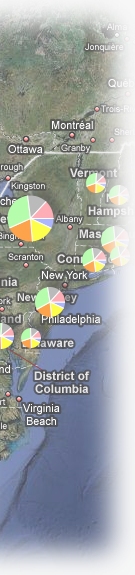
Map data as charts
You may have a set of map locations (points) for which you want to show a number of different values -- for example, sales by product category, or temperature changes through time. Plug and Play Maps lets you plot pie, bar, and line charts at each point location by indicating the chart type you want and providing a list of the data items for each point that should be plotted on the chart. You can also scale the size of the chart by an additional data item, as shown the Age Distribution Examples (note that you can click on the charts in the first demo page to "drill down" to more detailed regional maps with additional charts).
To get a chart, you specify &sym=charts and the chart type (default is pie) with the &charttype=line (or bar or pie) setting. You indicate the data items to be included in the chart, and their order, by listing the item names (e.g., column headings in a spreadsheet or attribute table) separated by commas. Optionally, you can also list the colors to use for each item by giving a list of color names (or RGB hex codes) separated by commas. For example:
&sym=charts&charttype=pie&chartitems=Northeast,Mid-Atlantic,South,Mid-west,Mountain,West&chartcolors=white,cyan,yellow,green,yellow,red
Display images on a map
You can add images (image files like JPEG, PNG, or GIF) to your maps covering specific locations (latitude-longitude ranges). This could be used to illustrate the map with location-specific images, or it could be used to display a data image where the image pixel values indicate data values for specific geographic locations (this is a common way of rendering climate data, for example, as an image of false-color cells showing the geographic pattern of temperate, precipitation, or other values).
To place an image on the map, you specify the image itself using the standard &datafile parameter, and you specify the lower-left and upper-right corner coordinates of the image in latitude-longitude pairs using the &bounds parameter:
&datafile=http://mysite.com/climate/precip.png&bounds=20,-120|50,-60
Style the legend
Set the legend location and size
By default, the map is put on your web page wherever you insert the Plug and Play Maps <script> in your web page's HTML. The map will be a pre-determined height and width, and if you don't disable the legend, it will have a legend of the same height to its right. The legend style (border, etc), is also pre-determined.
You can position and style your map and legend differently by providing your own <div> for the map and/or legend, and passing the <div>'s id to Plug and Play Maps as a query parameter in the <script>. With this approach, you can completely control the position, size, and appearance of the map and legend (see the map div section for further details on styling the map). The following example shows <script> in the HTML <head> section referring to the <div> that will contain the legend in the <body> section:
    <head>
        ...
        <script src="http://maps.google.com/maps?file=api&v=2.x&key=ABQIAA...."></script>
        <script src="http://www.plugandplaymaps.com/js?g=mylegenddiv&j={"icons":[{"legtext": "Sample sites", "items": ["latlon"], "values": [["42,-72"],["42.5,-72.5"]]}]}'></script>
        ...
    </head>
    <body>
        ...
        <div id=mylegenddiv style="width: 300; height: 600; border: 1px solid green;"></div>
        ...
    </body>
Control initial data layer visibility
You may not want all of your datalayers to be displayed when your map first appears. By default, every data layer is displayed when the map is first rendered; to turn off the initial visibility of one or more datalayers, use the &initvis parameter. For example, the following map will render with 3 data layers in the legend, but only two of them are displayed when the map first loads:
    &datafile1=http://mysite.com/data/file1.csv
    &datafile2=http://mysite.com/data/file2.csv&initvis2=off
    &datafile3=http://mysite.com/data/file3.csv
Group data layers in the legend
You can put two or more data layers into a legend group so that they can be turned on and off together or turned on just one-at-a-time, and so that clicking on the group's legend text will zoom to the collection of all the group's data. There are two types of groups: the default type is 'checkbox', which gives each layer within the group its own checkbox to control its visibility independently; alternatively, you can create a 'radio' group, in which the layer visibility is mutually exclusive and only one layer from the group can be visible at a time.
Groups can have as many or as few layers as you wish (but a group of one will be displayed as a regular layer, not inside of a group), and the layers can be a mix of any symbol types (icons, lines, etc). Groups are simultaneously created and populated by the &group parameter for each data layer. By default, the text appearing for the group checkbox is the group name, but you can specify something else explicitly using the &grouplegtext parameter, which only has to be provided for one of the group layers. As an example, the following creates two groups with two layers each, and gives each group a custom legend text:
    &datafile1=http://mysite.com/data/file1.csv&group1=water&grouplegtext1=Water and Sewer

    &datafile2=http://mysite.com/data/file2.csv&group2=water

    &datafile3=http://mysite.com/data/file3.csv&group3=elec&grouplegtext3=Electrical

    &datafile4=http://mysite.com/data/file4.csv&group4=elec
Note the potential for confusion: it might appear that the above code creates four groups (group1..group4), but the number at the end of each group indicates the data layer to which the group should be applied; in other words, "group3" means "the group to which layer 3 belongs". The number of groups created is determined by the number of distinct group values you provide -- in this case 2: water is one group, and elec is another.
To create a radio-button group, in which only one layer can be displayed at a time, use the &grouptype=radio option on one of the data layers in the group (to save you the hassle of entering the radio option for all of the members of a group, it is enough to just add it to one of the layers). Unlike checkbox groups, there can only be a single layer visible at all times in a radio group, so you also need to specify the layer to show when the map is first displayed with the &initvis parameter (if you don't specify any layer, the first one in the group will be displayed). The following code shows 5 layers together in a group labeled Census, with the last layer (for the year 2000) selected for initial display:
    &datafile1=http://mysite.com/census/1960.csv&group1=Census&grouptype1=radio

    &datafile2=http://mysite.com/census/1970.csv&group2=Census

    &datafile3=http://mysite.com/census/1980.csv&group3=Census

    &datafile4=http://mysite.com/census/1990.csv&group4=Census

    &datafile5=http://mysite.com/census/2000.csv&group5=Census&initvis5=on
If you create more than one group for a map, the order of the groups in the legend is determined by the lowest-numbered data layer in each group, top to bottom. Within each group, the order is lowest-numbered data layer to highest, top to bottom.
If there are settings you want to apply to all of the data layers in a group, you can do so by specifying a group parameter for just one of the datalayers, and it will be applied to all members of that group. A group parameter is just the regular parameter name preceded with the word "group". For example, if you want all of the layers in a group to use the same datafile (but perhaps different data items from within that file), you can specify &groupdatafile1=http://mysite.com/data/census.shp. This approach saves having to enter the same setting for every layer in a group -- instead you just enter it once, and only pass parameters for the other data layers for the things that are different from one layer to the next. Any layer-specific parameter (i.e., one that does not start with the word 'group') will over-ride any group-level setting. For example, here is the script for the radio-group demo in the Gallery (reformatted into several lines for readability):
    <script src='http://www.plugandplaymaps.com/js/?k=4ab87cad9e43869c

    &grouptype1=radio&groupdatafile1=hosted:statepop1960-2000.csv

    &groupsym1=areas&groupcolorminval1=0&groupcolormaxval1=20000000

    &grouplegsym1=off&grouplegtext1=Population (millions)

    &group1=census&colorscaleitem1=1960&legtext1=1960

    &group2=census&colorscaleitem2=1970&legtext2=1970

    &group3=census&colorscaleitem3=1980&legtext3=1980

    &group4=census&colorscaleitem4=1990&legtext4=1990

    &group5=census&colorscaleitem5=2000&legtext5=2000

    &legsym5=on&legscl5=0.000001&legfmt5=0.0f&colorscalelegtext5=off

    &zoominit=25.5,-124.5|50.5,-65.5'></script>
This example shows all of the group features working together. The order of the parameters is unimportant -- Plug and Play Maps will create the same result no matter what order you pass the settings -- but to emphasize the use of group-level settings we display them together before the layer-specific settings. The first 3 lines of settings (after the plugandplaymaps.com call and keycode) configure the group to be a radio-type with a common range of color values (so all of the layers will be displayed with each color associated with the same value) and no legend symbol displayed. Note that the trailing number "1" for all of these group settings simply associates them with data layer "1", but because they are group settings, they will be applied to all members in the same group as data layer "1"; we could just as easily have associated all of the group settings with data layer "5", but the result would be the same because data layers "1" and "5" are in the same group. The next 5 lines "subscribe" five data layers to the same group, called "census", and specify the things that are different about the layers, namely the colorscaleitem (data column of values used for mapping) and the legend text. Finally, the legend settings for data layer "5" are set to override the group settings, showing the legend symbol just for this layer and giving it some custom formatting.
Set the legend text
By default, the legend text for each data layer will be the name of the datafile (if any), or the name of the layer's group. You can override the default layer name by specifying the legend text for a datalayer, as in the examples below:
Example with query parameters in the Plug and Play Maps <script> -- the first datalayer will appear as "file1" in the legend; the second data layer will appear as "Cell towers":
&datafile1=http:/mysite.com/data/file1.csv&datafile2=http://mysite.com/data/file2.csv&legtext2=Cell towers
Example with settings in a JSON string or file -- the first datalayer will appear as "file1" in the legend; the second data layer will appear as "Cell towers":
"icons": [{"datafile": "http://mysite.com/data/file1.csv"}, {"datafile": "http://mysite.com/data/file2.csv", "legtext": "Cell towers"}]
Customize or hide the legend label for scaled layers
When you apply a colorscale, a weightscale, or color categories to a data layer, Plug and Play Maps automatically generates a label in the legend for the symbol to tell your users what data item was used for the colorscaling (or what pair of data items, if you use the divide by option). If you don't like the default text, you can supply your own using the &colorscalelegtext= or &weightscalelegtext= parameter, or you can remove the label altogether by specifying a value of off: e.g., &colorscalelegtext=off.
Customize the min/max number format for scaled layers
The min and max range values displayed when you apply colorscales or weightscales may need help if they are very large or small, or if they include too many decimal places. There are two parameters you can use to adjust the min and max values displayed in the legend: &legfmt and &legscl.
Use &legfmt to provide an (unfortunately cryptic) format string to control the number of decimal digits displayed, whether to use exponential notation, and more. Describing these codes is beyond the scope of this How To page, but you can find many useful resources elsewhere on the web by searching on "Python format codes". When entering the code with the &legfmt= parameter, do NOT include the beginning % (percent) sign, as it will cause problems interpreting the overall map request string.
Use &legscl to change the min and max values themselves. For example, if you are mapping country populations, the range may be in the millions and the legend min and max can be hard to read. Passing &legscl=0.000001 will display the min and max as the number of millions (e.g., 1.5 to 10.5 rather than 1,500,000 to 10,500,000). Whatever &legscl you provide, the actual data min and max values will be multiplied by that scale factor to determine the values to display in the legend. Used together with &legfmt and customized legend text for scaled data layers you can configure the legend for maximum legibility.
Hide a legend checkbox for a data layer
By default, every data layer and legend group has a checkbox next to it to allow your visitors to turn layers on and off in the map. If you don't want them to be able to do this, you can remove the checkbox for any layer.
Example with query parameters in the Plug and Play Maps <script>:
&datafile1=http:/mysite.com/data/file1.csv&legtype1=fixed
Example with settings in a JSON string or file:
"icons": [{"datafile": "http://mysite.com/data/file1.csv", "legtype": "fixed"}]
Hide the legend symbol for a data layer
By default, every data layer has a symbol in the legend to show how that layer's data are displayed in the map. If you don't want these symbols, you can remove them for any layer.
Example with query parameters in the Plug and Play Maps <script>:
&datafile1=http:/mysite.com/data/file1.csv&legsym1=off
Example with settings in a JSON string or file:
"icons": [{"datafile": "http://mysite.com/data/file1.csv", "legsym": "off"}]
Turn off the zoom-to-datalayer action for the legend text
By default, the text of a data layer's legend entry is a clickable link that will zoom the map to the extent of that layer's data. If you don't want this behavior, you can turn it off for any layer.
Example with query parameters in the Plug and Play Maps <script>:
&datafile1=http:/mysite.com/data/file1.csv&legzoom1=off
Example with settings in a JSON string or file:
"icons": [{"datafile": "http://mysite.com/data/file1.csv", "legzoom": "off"}]
Hide the whole legend entry for a data layer
By default, every data layer has a legend entry. If you don't want one, you can remove it entirely for any layer (this will remove the checkbox, text, and symbols altogether).
Example with query parameters in the Plug and Play Maps <script>:
&datafile1=http:/mysite.com/data/file1.csv&legtype1=none
Example with settings in a JSON string or file:
"icons": [{"datafile": "http://mysite.com/data/file1.csv", "legtype": "none"}]
Use tooltips, popups, and links
Create a tooltip (appears when mouse hovers over an icon)
For simple icon data layers, there is no tooltip when the user hovers their mouse over a data icon. If you colorscale or weightscale a datalayer, then a tooltip is automatically created for the icons in that data layer showing the data value used for scaling each icon.
To provide tooltips when there are none, or to override the automatically generated tooltips, you can set them explicitly, either as a single tooltip to appear for all icons in the layer, or as a data item in the layer's data to be used for the tooltip on an icon-by-icon basis.
As an alternative to the options below using query parameters or settings in a JSON string, you can also set a tooltip by simply having a column in your data layer's table named "tooltip". This works especially well when you are passing your data values in a JSON string rather than pointing to a datafile; just add an item named "tooltip" to the layers "items" list, and add a tooltip string to each data record.
Example with query parameters in the Plug and Play Maps <script>:
    <!-- set a single tooltip for all icons in the data layer -->
    &datafile1=http:/mysite.com/data/file1.csv&tooltip1=Locations are approximate
    OR
    <!-- name the item in the data's table to use for the tooltip for each icon -->
    &datafile1=http:/mysite.com/data/file1.csv&tooltipitem1=OwnerName
Example with settings in a JSON string or file:
    <!-- set a single tooltip for all icons in the data layer -->
    "icons": [{"datafile": "http://mysite.com/data/file1.csv", "tooltip": "Locations are approximate"}]
    OR
    <!-- name the item in the data's table to use for the tooltip for each icon -->
    "icons": [{"datafile": "http://mysite.com/data/file1.csv", "tooltipitem": "OwnerName"}]
Create a popup window (appears when an object in the map is clicked)
For any feature type (icon, chart, line, or area), you can turn your map data into clickable objects that open a popup window. The window can contain any or all of the following:
- a title (which may also be a clickable link)
- an image* (which may also be a clickable link)
- a caption (which may also be a clickable link)
*note that an image also requires an image size to be provided so the popup window can be sized properly (it is created before the image is loaded).
These window elements can be set once for an entire data layer (all features in the data layer will show the same popup window), or they can be set on a feature-by-feature basis where each object (each icon, line, etc) has its own popup window contents that may be different from those of other features.
By default, if there are any items in a data layer's table other than the location information, those items are assembled into a list and put into a popup window automatically. This lets your visitors quickly see all of the data associated with each feature (icon, line, etc) in your data layer by clicking on the feature in the map.
To create a custom popup window, set at least one of the items above (title, image, or caption) as a query parameter or JSON setting, or else create a column or columns in your data layer's table called "title" and/or "image" and/or "caption" and fill them with the text or image you want to use for each object in the data layer (this option works very conveniently when you are passing your data in a JSON string rather than pointing to a datafile, because you just add columns to the data table for any of popup window elements you want).
Example with query parameters in the Plug and Play Maps <script>:
    <!-- set a single popup window for all objects in the data layer -->
    &datafile1=http:/mysite.com/data/file1.csv&title1=Always Nearby!&image1=http://mysite.com/mylogo.png&isize1=128,128&ilink1=http://mysite.com
    OR
    <!-- name the item(s) in the data's table to use for the popup window contents for each object -->
    &datafile1=http:/mysite.com/data/file1.csv&titleitem1=PropertyName&imageitem1=PropertyPhoto&isizeitem1=PhotoSize&ilinkitem1=PropertyListing
Example with settings in a JSON string or file:
    <!-- set a single popup window for all objects in the data layer -->
    "icons": [{"datafile": "http://mysite.com/data/file1.csv", "title": "Always Nearby!", "image": "http://mysite.com/mylogo.png", "isize": "128,128", "ilink": "http://mysite.com"}]
    OR
    <!-- name the item in the data's table to use for the popup window contents for each object -->
    "icons": [{"datafile": "http://mysite.com/data/file1.csv", "titleitem": "PropertyName", "imageitem": "PropertyPhoto", "isizeitem": "PhotoSize", "ilinkitem": "PropertyListing"}]
Create a datalink (followed when an object in the map is clicked)
For any feature type (icon, chart, line, or area), you can turn your map data into clickable objects that link to other web pages or websites. The links can be set once for an entire data layer (all features in the data layer will go to the same destination), or they can be set on a feature-by-feature basis where each object (icon, line, etc) has its own link destination that may be different from the target of other features.
To set a datalink, either specify it as a query parameter or JSON setting, or else create a column in your data layer's table called "link" and fill it with the link destination (URL) for each object in the data layer (this option works well when passing your data in a JSON string instead of pointing to a datafile; you can simply add a "link" column to your items and each data record).
Example with query parameters in the Plug and Play Maps <script>:
    <!-- set a single link for all objects in the data layer -->
    &datafile1=http:/mysite.com/data/file1.csv&link1=http://mysite.com/
    OR
    <!-- name the item in the data's table to use for the link for each object -->
    &datafile1=http:/mysite.com/data/file1.csv&linkitem1=target
Example with settings in a JSON string or file:
    <!-- set a single link for all objects in the data layer -->
    "icons": [{"datafile": "http://mysite.com/data/file1.csv", "link": "http://mysite.com/"}]
    OR
    <!-- name the item in the data's table to use for the link for each object -->
    "icons": [{"datafile": "http://mysite.com/data/file1.csv", "linkitem": "url"}]
Defining custom colors, colorsets, and colorbars
Defining custom named colors
Plug and Play Maps provides 16 pre-defined colors: red, green, blue, cyan, pink, yellow, lightred, lightgreen, lightblue, darkcyan, purple, orange, darkgray, lightgray, white, and black.
You can define additional named colors using the JSON query parameter. Colors are defined in name:value pairs, where the value is a 6- or 3-character hexadecimal RGB (red-green-blue) color string, as is used in many places (CSS and HTML colors, Google Charts, etc). Note that the commonly-used # prefix is not used. Some examples:
"namedcolors":{"silver":"e0e0e0","lime":"c0ff00","forest":"406000"}
Defining custom colorsets
Colorsets are ordered lists of named colors that you can use to display categorical data. You can define custom colorsets using any of the 16 pre-defined colors in any order, or using any custom named colors you define, or any mix of the two. You can also just use the RGB hex color codes if you prefer.
Like custom colors, custom colorsets are also defined in the JSON query parameter. The following example defines some custom named colors and two custom colorsets that use them:
j={"namedcolors":{"lime":"c0ff00", "forest":"406000"}, "colorsets":{"vegcolors":["forest","green","lightgreen","lime","yellow"], "spring":["yellow","lime","green","blue","white"]}}
Defining custom colorbars
Colorbars are sets of (usually 256) continuously-varying colors that you use to color-scale your data. You can define custom colorbars using a compact (if somewhat cryptic) string of expressions that define 3 color profiles for how the amount of red, green, and blue should vary across the colorbar spectrum.
A color you see on a computer screen is just a mix of 3 values, one each for the amount of red, green, and blue intensity. These color values vary from zero to 255. A colorbar has (up to) 256 such colors, typically varying smoothly across the range. You define these variations by indicating key points along a color profile for each color band (red, green, and blue). These key points define specific color intensities at specific points along the colorbar spectrum; in between these key points, each profile varies smoothly (linearly). The key points are not required to be at the same locations in each of the color bands, although they often are.
Each color profile (one each for red, green, and blue) is expressed as a series of value:intensity points. Perhaps the simplest example would be a profile that goes from no intensity (e.g., no red at all) at zero, to full intensity (e.g., bright red) at the high end of the colorbar spectrum. This would be expressed as "0:0,255:255". This just specifies a single profile for one color band (e.g., red). A colorset needs 3 profiles -- one each for red, green and blue.
Like custom colors, custom colorsets are also defined in the JSON query parameter. The following code snipped defines a number of colorbars, including some of the built-in colorbars; hopefully these are sufficient for you to adapt to create your own custom colorbars:
    j={"colorbars":[{"name":"gray", "rprofile":"0:0,255:255", "gprofile":"0:0,255:255", "bprofile":"0:0,255:255"},

                    {"green", "rprofile":"0:204,255:0", "gprofile":"0:255,255:219", "bprofile":"0:204,255:0"},

                    {"pseudo", "rprofile":"0:0,85:0,170:255,255:255", "gprofile":"0:0,85:255,170:255,255:0", "bprofile":"0:255,85:255,170:0,255:0"},

                    {"blue-red", "rprofile":"0:0,255:255", "gprofile":"0:0,128:128,255:0", "bprofile":"0:255,255:0"}
    ]}